|
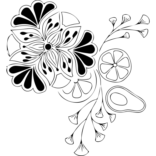
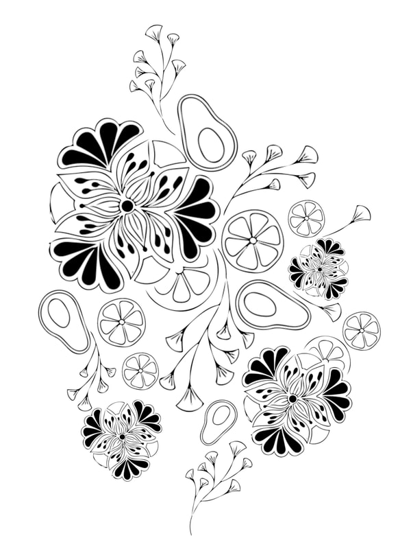
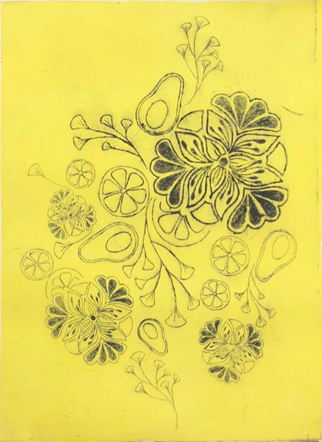
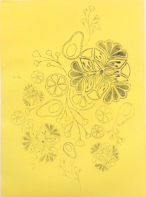
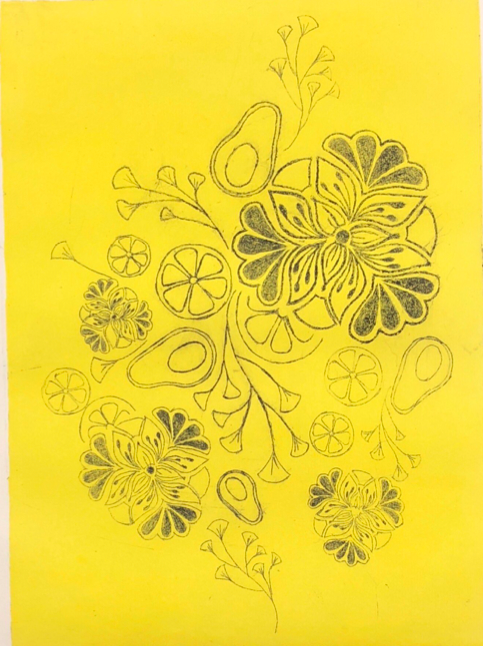
The first picture is the design that I created on the sketchbook and then I took picture of it. Then I put it on the Photoshop and reorganized it but with the pattern I drew on the paper. The second picture is what I have after I reorganized it. To start etching on the plate, we print out the pattern and tap under the plate. As we start etching, it’s hard at first, I get faster and faster. Some detail part of the design is hard to etch; however, as I practiced more and more, I get better. The third picture is when I finished etching the design.
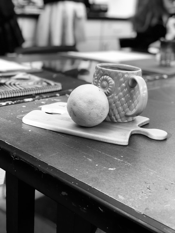
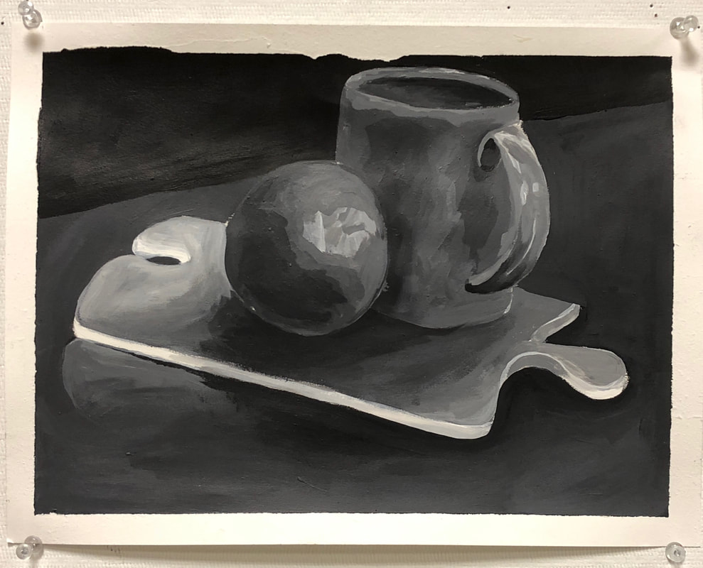
The next step will be the Dry Point Printmaking. After I cut the design, I need another plate to be the same size of the design to be the background. I picked the color yellow to be my background. We used barer to spread the color out. Then put the color on the bland sheet of plate. The black will be on the design piece. I totally have five papers to print. The first one is mashed and I learned that I needed to clean the plate well. The second on is very light so I put more color on the third one. I get improved gradually and finally I get a perfect print on the last one. This project not only taught me not how to do Dry Point Printmaking, but also taught me how to use Photoshop to duplicate the pattern.
0 Comments
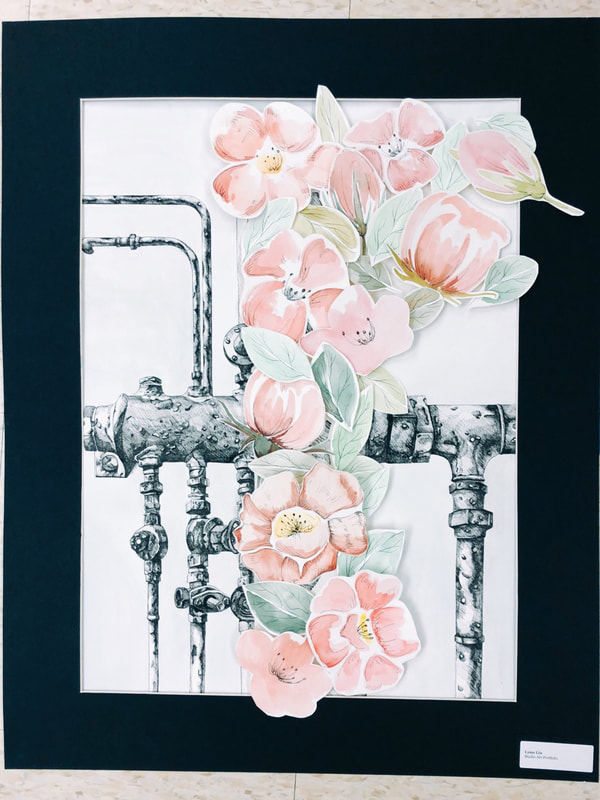
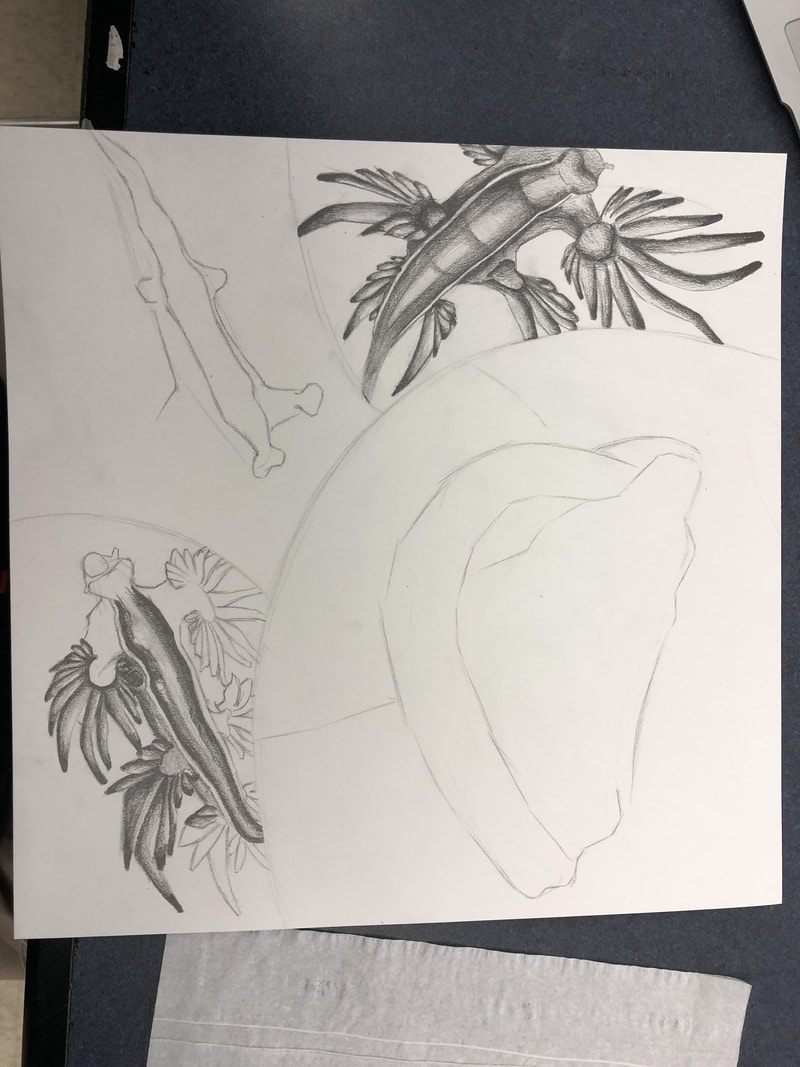
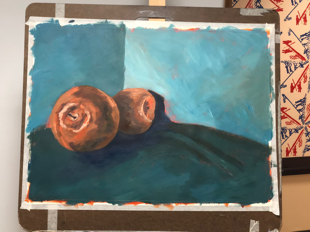
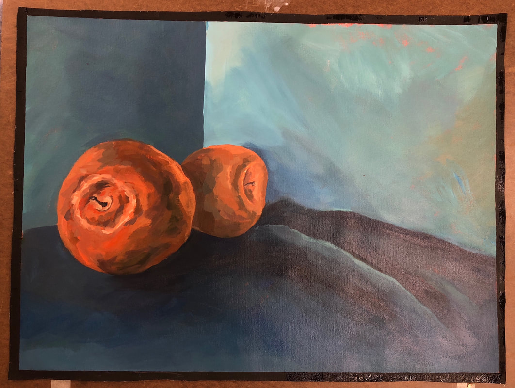
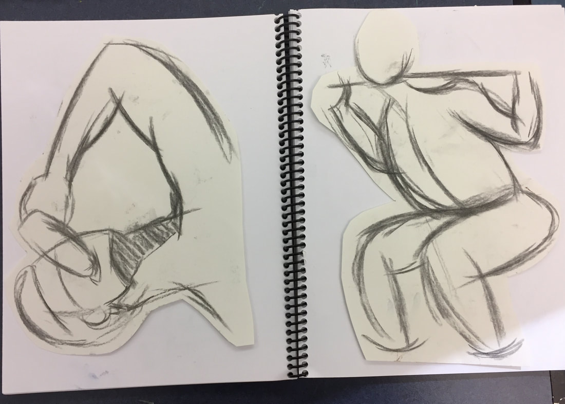
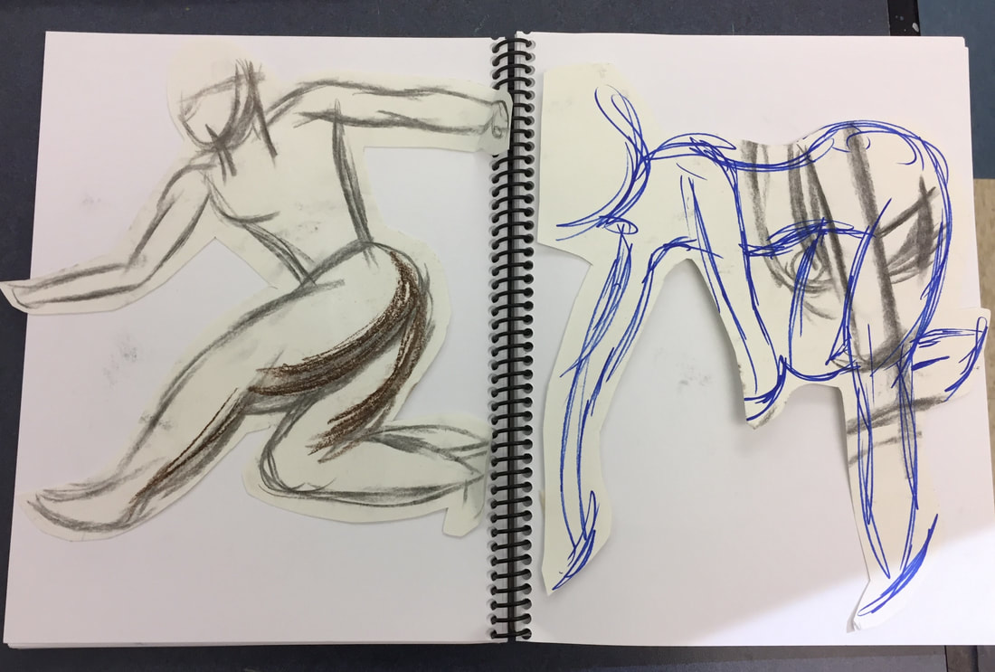
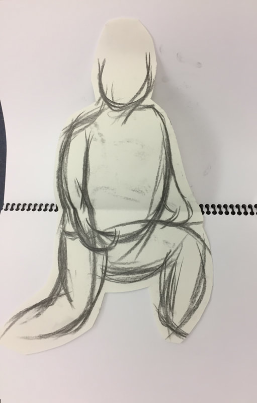
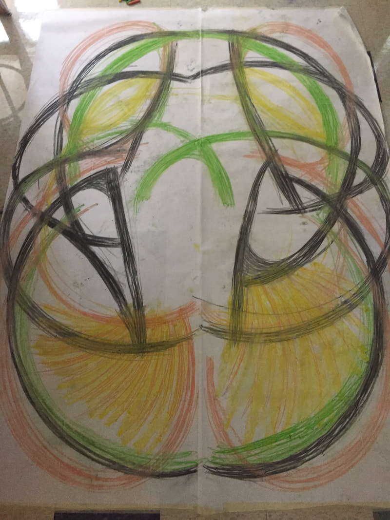
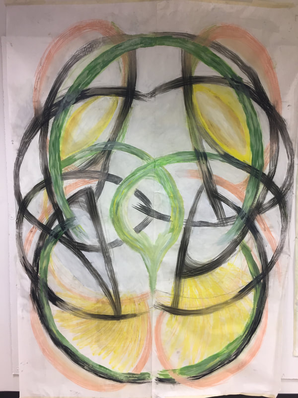
At the bingeing of this project, we did five pieces of drawing each day. We have given a topic each day and need to finish the work on the class. At first, the time is rush and I couldn’t finish the drawing. However, I get faster and faster. Also, this process helps us to be more creative. Everyone in the class did the different thing. After we finished it. We get to pick two of them and combine together to create a bigger piece of artwork.
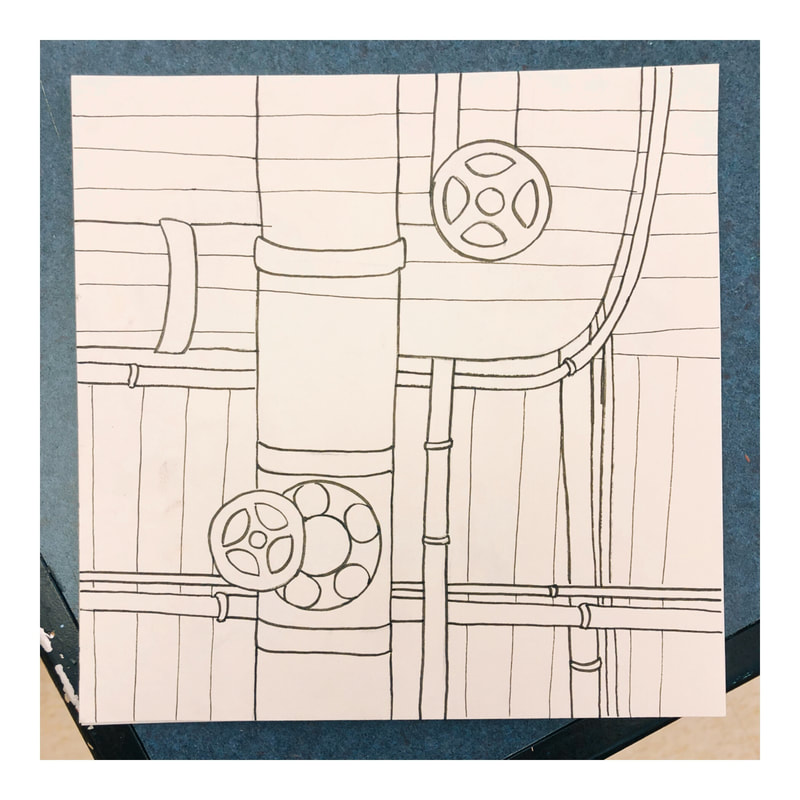
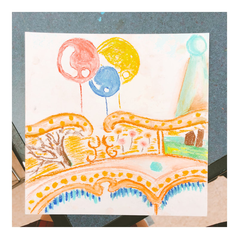
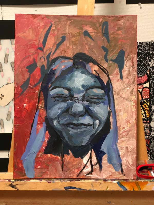
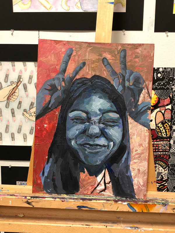
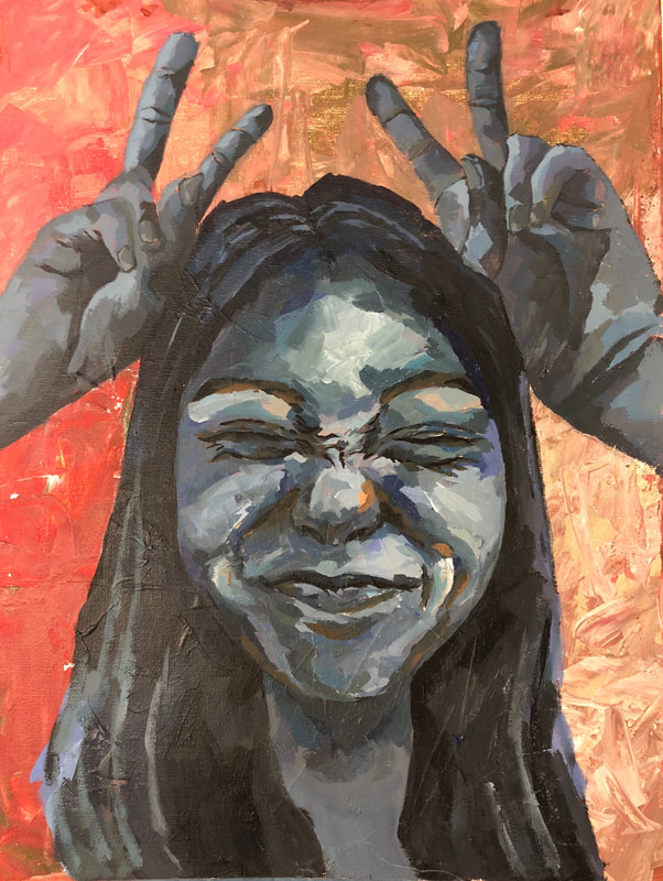
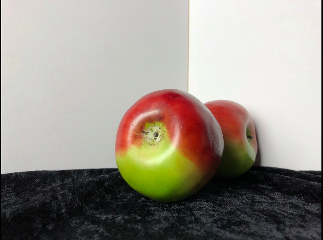
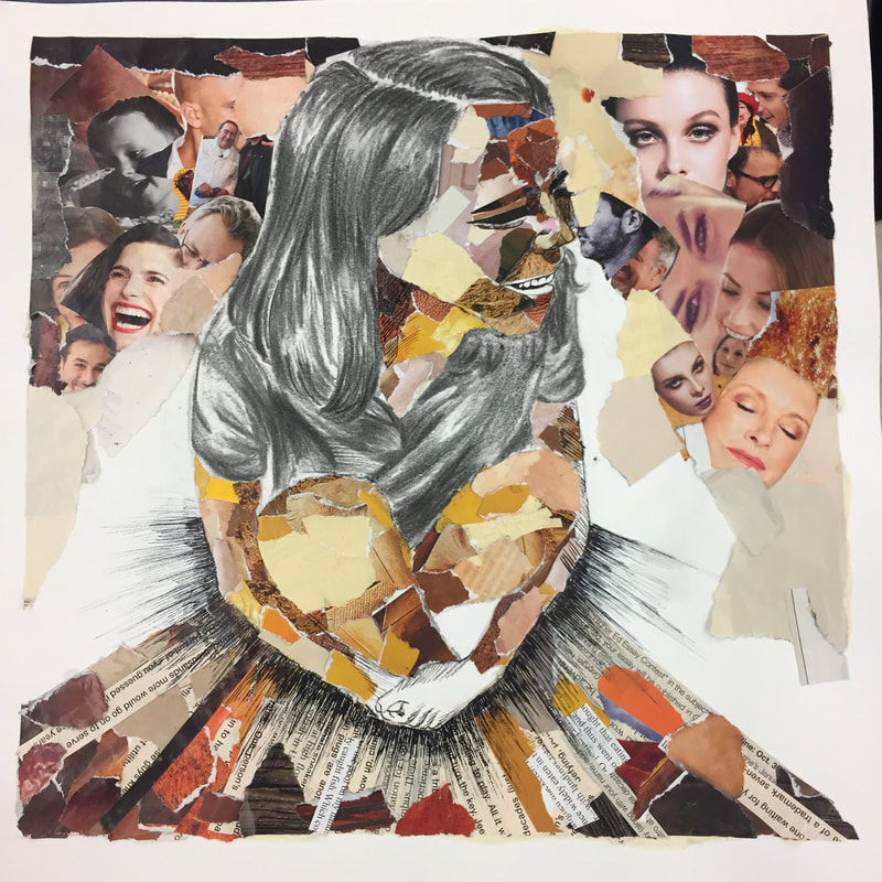
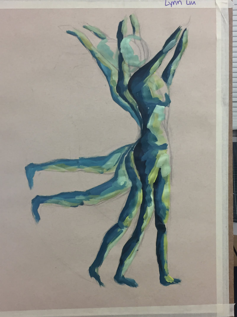
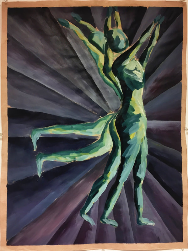
I decided to combine the industrial pipes and flowers. The pipes represent the modern technology and air, water pollution. The flowers represent the nature. First, I sketched the pipes and left a part on the middle for the flowers. I used ink pen for the pipes and watercolor with ink pen outline for the flowers. I draw the flower on the different piece of paper. Then I cut those out. I taped paper on the back of the flowers to make it pop out. Last, I used watercolor to wash through the background. This is the piece was little rush because I need to finish it before the art show. However, this is one of the favorite piece that I have made in school. First of all, I used orange, white, green, red and brown on my background. So I chose blue as my main color for my face part. I defined the dark part and the light part first, and then I starting with the medium color tone. After I started with my face, I realized that it’s too empty on the top so I decided to add hands on the top part. Also, I adjusted the hairline to make it higher.
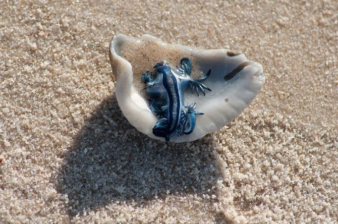
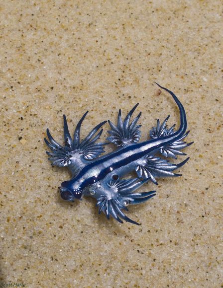
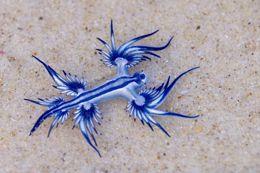
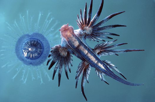
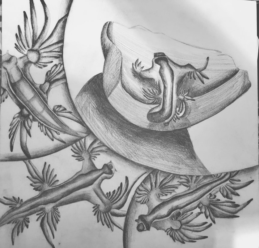
During this project, I had learned that how to switch between detail brushes and big brushes. I have used small brushes around my eyes part because there are a lot wrinkles. I think drawing the wrinkles is the hardest part for this project. I used black to draw the wrinkle lines first and then I add dark blue between each wrinkle to make it more natural. Last, I tried to add some background color such as olive green and orange color on my face. However, it looks too strange on the bright part so I just add them on the dark part. For self-portrait, I have always drawn the face first and then do the background. I think that a very good experience to try new way. And I have enough time to work on this project. I think this is one of my favorite projects so far. This is the first project in this semester and I think it’s a really good beginning. Before we start the bug project, we had chance to look at real bug and did some practice. I think this step is really helpful for me. And we read more to learn more about value. The animal I did for this project is blue glacuus. The first four pictures are the pictures that I used for this project. When I am doing research, there is not much pictures of different angle for this animal and not many people have seen or know this animal. However, I think the structure and shape of this animal is really fun and special to do. As I start drawing, I realized that there are not many details on blue glacuus. So I focused on the value and the shape. Also, after I finish the first blue glacuus, I realized that the blue glacuus looks very flat and I am missing some dark value. After I put some dark value, the animal suddenly pup out. When I finish all the blue glacuus, I put some dark value on the edge of dividing line to make it more natural. I would put some blue color in my project, but unfortunately, I don’t have much material with me at that time.
|
AuthorWrite something about yourself. No need to be fancy, just an overview. Archives
May 2018
Categories |
 RSS Feed
